How we created the Mountain Man...
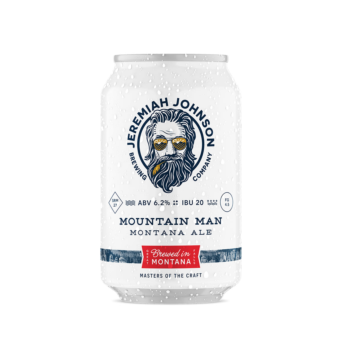
Previously, The Front Brewing Company had been using a painted illustration for their original Mountain Man Beer label. The character had a long beard, sunglasses with a sunset reflection, and a wheat stem dangling from his mouth. They decided that a woodcut style revision of the mountain man with these key elements could become the face of the brand as it transitioned to Jeremiah Johnson Brewing Company.
Initially, we considered doing two illustrations. One would have lots of detail, and would show more of the character in an outdoor setting. The other would be a very simple, iconic image suited for use in a logo.
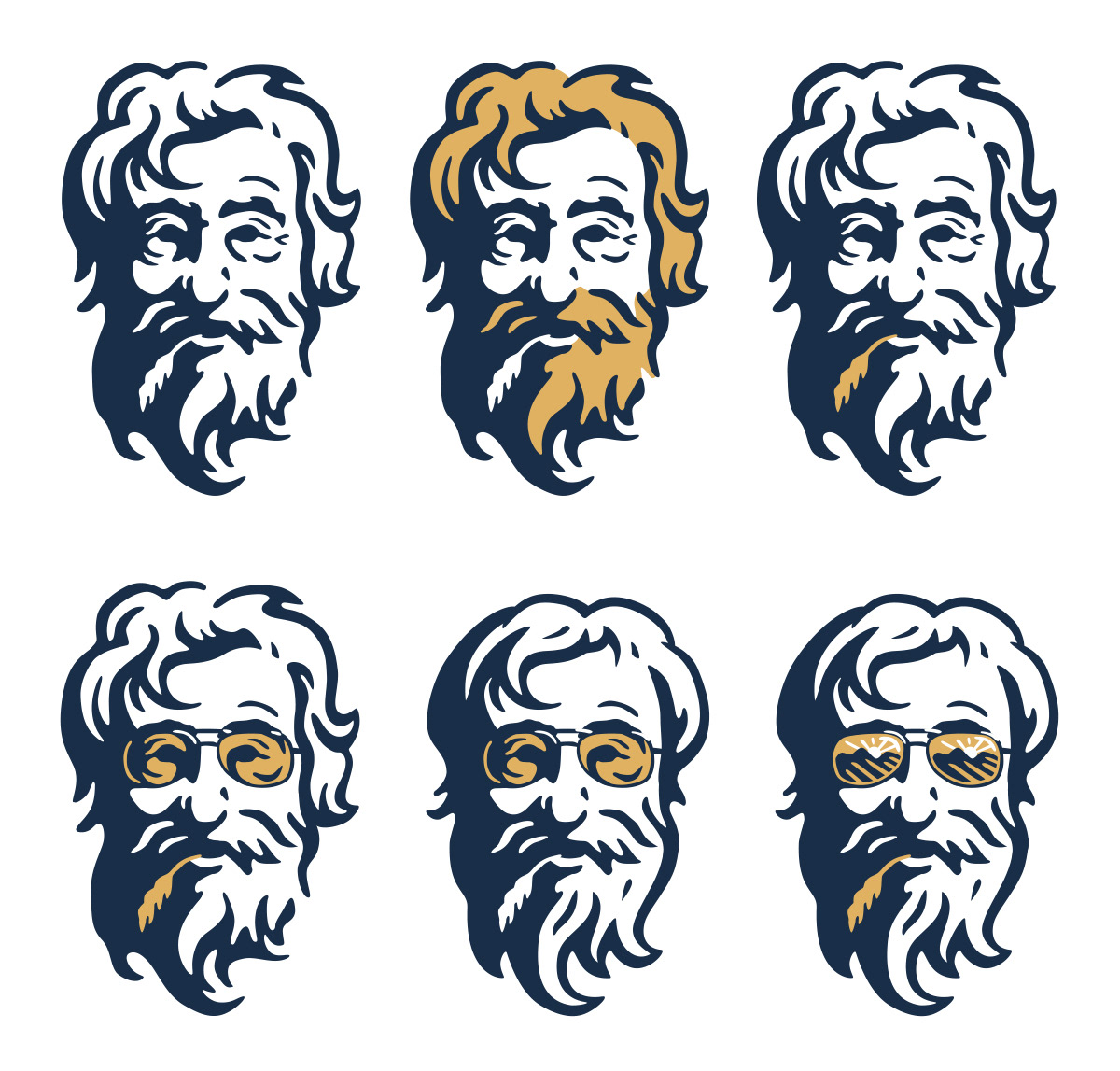
As you can see, the simple one was sort of a mountain man version of Colonel Sanders.
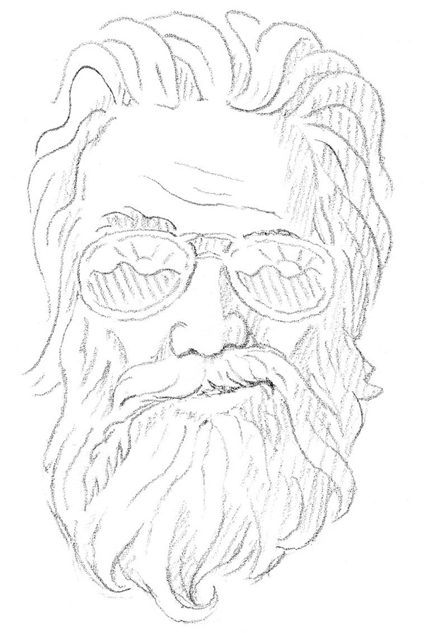
After trying the simple version, we decided that it would be better to compromise between simple and detailed, and to have a style that would work both in a larger scene and a logo. My first task was to concentrate on the face. I did a number of pencil sketches to pin down the expression, the hair, the beard, the shape of the face and the sunglasses.

Then I rendered it in Illustrator.

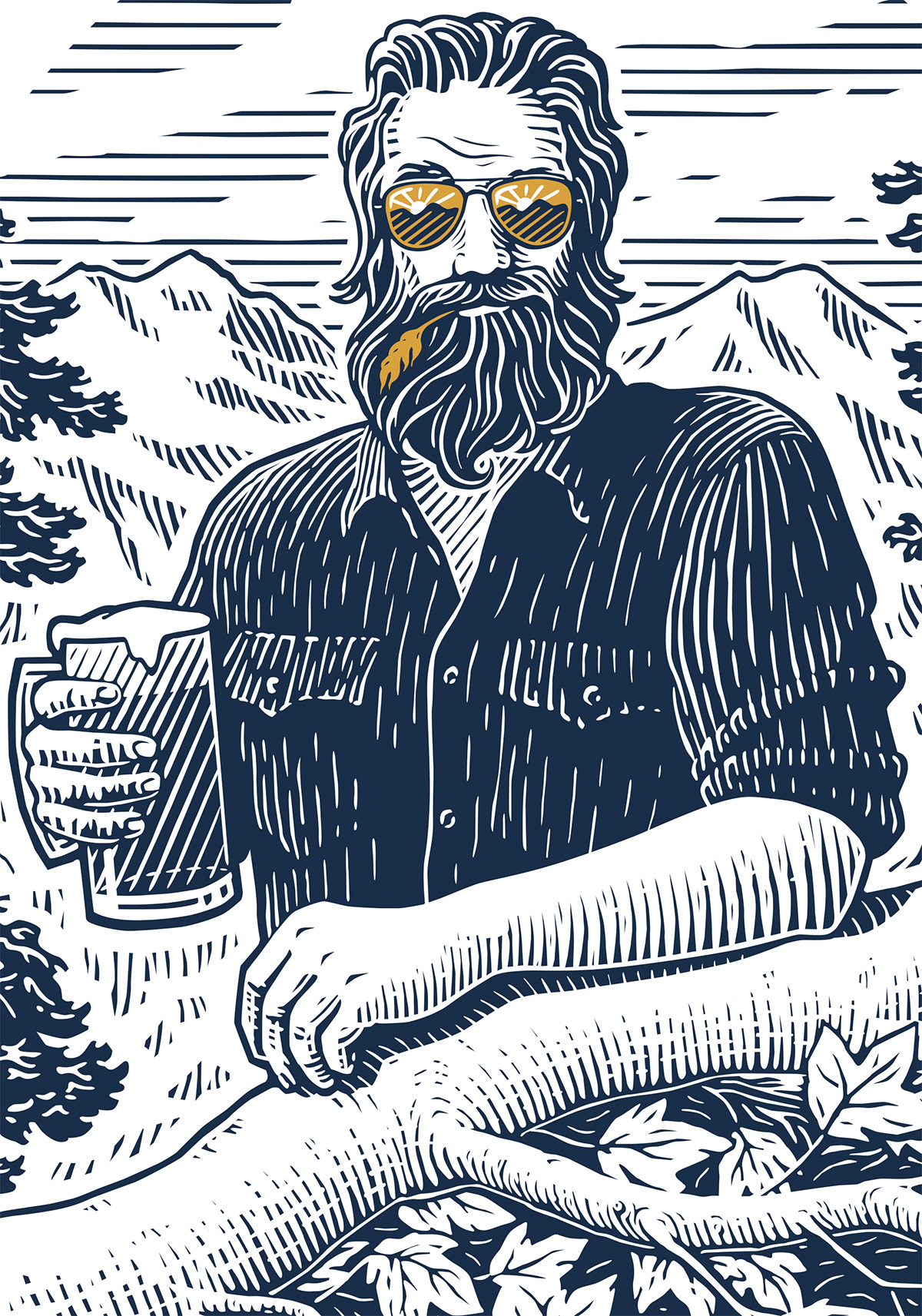
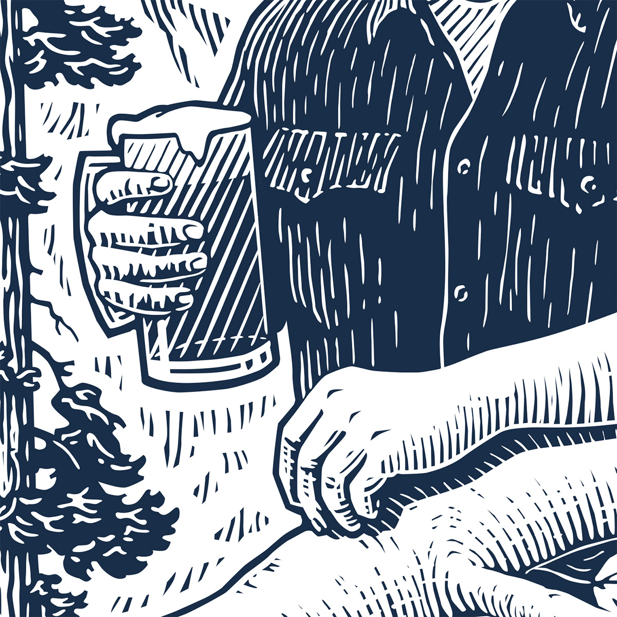
The next step was to have him hanging out in a forest high in the mountains of Montana.
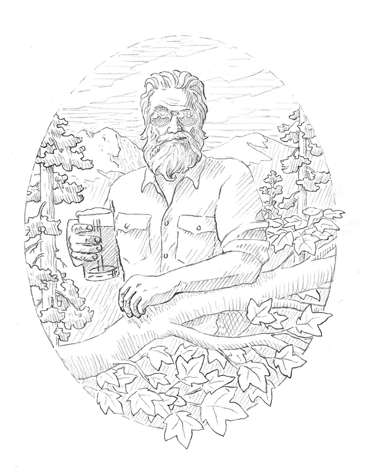
This was the final rough.
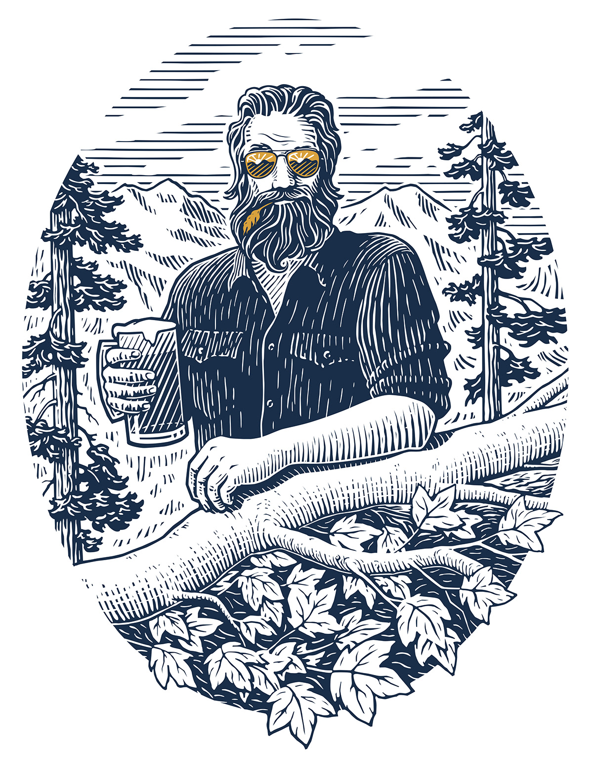
I made a few changes from the pencil rough to this digital woodcut, like removing a pine tree and maple limbs on the right side. They were causing visual tension and I didn't want the forest to distract from the mountain man.
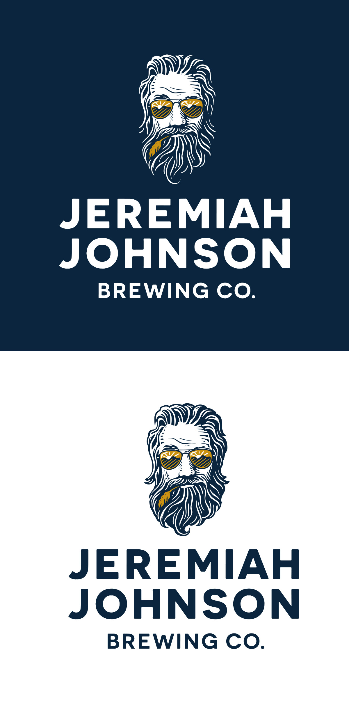
This guy has to work on blue, white and golden beer colored backgrounds. The gold in the glasses and wheat is intended to match the Mountain Man beer when on a glass.

Here's another version designed for a circle in which he is raising the mug.

It has to work on both a dark and white background


Cheers!